


.png)
In 2021, I completed one of my two graphic design internships with the Ward Museum of Wildfowl Art. Located on Maryland's Lower Eastern Shore, the museum has long served as a cultural landmark, celebrating the region's rich heritage of decoy carving, wildfowl art, and traditional craftsmanship. (The museum has since expanded its mission and is now known as the Museum of Eastern Shore Culture.)
During my internship, I designed a variety of promotional materials for both digital and print media, including social media graphics, event marketing, and branded collateral. Each project required balancing the museum's established visual identity with engaging, contemporary designs that appealed to both local audiences and visitors. This experience strengthened my ability to design for a cultural institution while creating cohesive marketing materials across multiple platforms.
2 Internships in 6 Months:
Client: The Ward Museum of Wildfowl Art
Type : Social Media Design, Print Media Design, Editorial Design, and Promotional Material Design
Logo :

First Project :
One of the first projects I worked on during my internship with the Ward Museum was designing a series of social media graphics to promote their Free Fridays campaign. The goal was to create eye-catching posts that encouraged visitors to take advantage of free museum admission while remaining consistent with the museum's established brand.
One of the unique challenges of this project was selecting which pieces from the museum's collection to feature in each design. With so many remarkable works to choose from, I carefully considered how each piece would complement the overall layout and help create visually engaging posts that reflected the museum's artistic identity.

First Project :
The next project I worked on was a full-page magazine advertisement promoting the Ward Museum's World Championship of Wildfowl Carving Competition and Art Festival. The objective was to create a design that felt clean and modern while remaining vibrant and visually engaging—capturing the creativity and energy of the festival.
To begin the project, I developed three distinct design concepts for the team to review and discuss. Presenting multiple options allowed us to explore different creative directions while ensuring the design aligned with the museum's vision. Once a concept was selected, we worked collaboratively through several rounds of refinements, fine-tuning the layout, typography, and imagery until we arrived at a final design that was ready for print.


Final Design :

Many Proofs -One Design :
One of the most extensive projects I worked on during my internship with the Ward Museum was creating the promotional poster and magazine advertisement for their annual photography festival. This project was especially exciting because it combined vibrant photography with a bright, youthful visual style, making it one of my favorite pieces to design.
The creative direction provided by the museum centered around four key themes: fun, youthful, watercolor, and Polaroid photography. With those concepts in mind, I began by sketching ideas and exploring a variety of visual directions. Excited by the creative possibilities, I developed numerous color palette variations before narrowing the options down to the strongest concept.
Once the overall color direction was approved, I continued refining the design by experimenting with different layouts and incorporating additional elements, such as camera film and watercolor paint splatters, to reinforce the festival's artistic theme. Through several rounds of thoughtful revisions and collaboration with the client, we finalized a cohesive design that was adapted for both the event poster and the magazine advertisement.


Final Poster :
Final Magazine Ad :


Pamphlet:
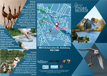

The final project I worked on during my internship with the Ward Museum was the redesign of the museum's informational pamphlet. This was one of the longest-running projects I was involved with, beginning at the start of my internship and continuing through its conclusion. Throughout the process, the pamphlet evolved through multiple layouts, design concepts, photo selections, and revisions before reaching its final form.
For the finished design, I wanted the visual language of the pamphlet to reflect the museum itself. I drew inspiration from the building's distinctive geometric architecture, incorporating clean lines and angular elements throughout the layout. I also illustrated and designed a custom map for the pamphlet, ensuring it matched the overall color palette and visual identity of the piece.
After many hours of designing, photo editing, prototyping, and refining every detail, we arrived at a final product that successfully balanced functionality with the museum's unique character. It was a rewarding project to conclude my internship and a fitting representation of everything I had learned throughout the experience.

